Saturday, 18 June 2016

Project 7: Sign Design


Design #1 - Radioactive Flower


Theme: Warning sign - Advocacy - Environmental


Message

This sign shows strong irony. Radioactivity, in our case, is an artificial occurrence, but I fashioned its warning sign out of a three-petaled flower, a symbol of beauty in nature.


Method

I scanned my drawing and used the pen tool to trace it. 

The eye dropper tool matched the yellow exactly to a street sign. 

Direct selection enabled me to edit the petal shapes after deselecting. 

Black and yellow were chosen because they are the original sign colours, and also because there are yellow flowers. 


~
Design #2 - Biohazardous Clover

Theme: Warning sign - Advocacy - Environmental


Message

This is a set with the Radioactive Flower sign. I created the biohazard symbol with a 3-leaf clover. 

It is ironic that biohazards, a result of humans tampering with what is natural, are associated with an pure, natural plant. 

Additionally, by hiding nature within the unnatural, these signs hint that though the damage is severe, nature is always quietly there, and that it isn't too late for redemption. 

These two signs are intended to evoke a reflective reaction and break through the viewer's everyday approach to life.


Method 

This sign was the most difficult to sketch and to trace, but it turned out well. 

The direct selection tool enabled me to smooth the shape. 

I tried different methods to have the three sticks surrounding the circle in the center (negative space), but what worked was simply making three black rectangles with the rectangle tool.

Green was used to emphasize the natural colour of the clover.


~
Design #3 - No Entry Into Universe


Theme: Limit Sign


Message

It is ironic that entrance into the Universe is denied, as the Universe is everything. It is meant to make the viewer wonder if humanity deserves the planet it was given, if it is capable of such a responsibility, if it is worthy. 

The sign is for everyone to see; everyone is part of this world - and no one is exempt from the responsibility it comes with.


Method 

I used a golden yellow instead of the standard red, so the sign is the Sun, and all the planets are contained in it. 

I wanted to draw my own planets, so I sketched, scanned them, and traced them with the pen tool and the ellipse tool.


~
Design #4 - Harry the Bicyclist


Theme: Pop Culture


Message

At first glance, this sign only seems a little different. 

But once you look deeper, familiar elements of a certain famous wizard surface. 

This sign uses wit to demonstrate that magic can be found in the most ordinary places, if you look hard enough. 
Life is what you make it out to be -
Every day can be magic.


Method


For the glasses and lightning bolt, I used a heavier weight so that they would stand out, but not so much so that it would appear crude.  


Final Thoughts


My favourite was the first sign, the radioactive flower; the idea was a sudden stroke of inspiration, and it turned out even better than I envisioned it.

I had difficulties using Illustrator and knowing which tools to use to solve problems.

Lastly, I am satisfied with how my creations are original; I drew every sign instead of tracing images from Google. And rather than copying random signs by other people from of lack of inspiration, I made the project about things I have ideas about and care about.

Thanks for reading!

Thursday, 5 May 2016

Project 6: Logo Design


Design 1


I chose Microsoft Sans Serif because the lack of serifs keeps the logo simple. Simplicity is the theme of this design; I enjoy uncomplicated things.
Italicizing it keeps things interesting.
Using all caps adds more straight lines to complement the two straight lines in the logo and counteract the circles, while rounded letters still remain to match the circles.

This logo uses soft shapes (circles) to create an overall angular logo shape (an irregular rectangle).

The two vertical lines are essential to making the S discernible.
The design mostly consists of circles created with the Shape Tool.

The two lines that complete the S are positive space, while each circle is a combination of positive and negative.

To create my logo, I made one perfect circle, then cloned it 12 more times for consistency. I chose a dark red-pink outline for the S, a light shade of pink for the T, and an in-between shade for the shared circle.


Design 2

I chose Microsoft San Serif again to continue the minimalistic approach, but this time, I made it all lowercase so that it takes away less attention from the logo.

This logo consists entirely of lines, which I made sure were parallel to each other and perpendicular by looking at the angle information that Illustrator gives me.

The S is positive space, while the T can be perceived as both negative or positive space.

The unique pattern was made with a "color" setting. The teal circles were originally green, but it wasn't resonating with me so I used the circle shape tool and the Subtract feature in the Pathfinder Palette to create my own blue, more noticeable cut-off circles.


Design 3

I chose this font because it was simple (sans serif, even, consistent lines) and yet unique. It is italicized and all-caps to match my yelling.

I typed ST a few times, then copied and pasted, and took approximately 6578892 minutes lining it up.

This logo is a strong example of use of negative space. The white S is reflected on the right, and the T is positive space so that it's more eye-catching and not too subtle.

I used the Rectangle Shape Tool to make the box around it that makes negative space possible.


Final Thoughts

-

My favourite design was the second - the red, purple and blue one. 
I had slight difficulties managing all the different colours.
I enjoyed the flexibility and space for creativity in this project.

Thursday, 31 March 2016

Project 4: Elements of Design

Shape (Back Lit)

To achieve this element of design, have the light source behind your subject, so that only the outline can be seen.

This photo shows contrast (light and dark). The poles are black because the sun is behind.

The above photo is an example of deep depth of field, as the background is relatively in focus in addition to the subject, which is dark.

Colour


Complementary colours are opposite each other on the spectrum. Red and green, blue and orange, and yellow and purple, as seen in the photo above, are all complementary colours.

Colours that are next to each other on the spectrum have a similar "temperature". Reds, oranges, and yellows are warm, while greens, blues, and violets are cool. This photo is rule of thirds as well.

Line


This shows a shallow depth of field.

This is a strong example of leading lines.

Form (Side Lit)

 Have your light source strike the subject from the side to show depth, highlight features, and give it a three-dimensional quality.
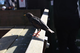
This photo shows contrast, because the brightness of the bench offsets the dark feathers of the bird. the shape of the bird is emphasized by the light hitting it from the right.

The birds show repetition. Additionally, there are leading lines. The sunlight reaches one side of the birds, giving depth.

  Texture

 A close-up or macro photo with adequate lighting will display the texture of the surface of your subject.
The uneven quality of the wet soil in this photo is clearly shown. Contrast (light and dark) is an emphasis technique here as well.

The rough surface of the wood is emphasized. Repetition of the pattern of the wood is shown.

Tuesday, 9 February 2016

Project 3: Comic Book

Broken Colour

Story Synopsis: The theme of the story is to appreciate what you have. In this case it’s colour. The story begins with Alex and his crew discovering the control centre to the city. He accidentally pulls something which ends up making the world lose its colour. In the end, the world regains its colour when the people learn to appreciate what they have. 

Characters:

Alex

Nick

 David

IS Students

Mr. Allen


Designer 1: Alex - Splash Page


"For this photo I used many different techniques to make this picture the way I wanted it to look. Half of the photo is black and white while the other half is filled in with color."

Designer 2: Serena - Page 1

Layer, filter, layer style
Serena – Designer 2 (Page 2)
Speech bubbles: I used the Rectangular Elliptical Tool, Fill Tool, and Pen Tool (for the triangle).
Captions: I used the Text Tool.
Cropping photos: I used the Rectangular Elliptical Tool to select the unwanted area and deleted (a quick, effective method).
For page 4 (I helped Nick)
Gradual colour fade:
I duplicated the photo, made one copy B&W, kept the other in colour, and used the Eraser Tool in a large size to erase part of one.

 Designer 3: Olivia - Page 2

"I took the color out of all the photos. I made the speech bubbles and put all the pictures onto the page. For this project we used layers to put the text boxes on the photos. For the text in our speech bubbles, we used Microsoft Sans Serif, italicized and all capitals. For the captions we used Garamond, bold and all capitals." 

Designer 4: Nick - Page 3


Photography Techniques


This photo displays a worm's eye view, leading lines, and a deep DOF.

Framing, contrast, rule of thirds, medium DOF.


Repetition, shallow DOF.


Rule of thirds.


Rule of thirds, Deep depth of field. 

  
Rule of thirds. 

Bird's eye view.

Rule of thirds, medium depth of field. 


Rule of thirds.


Rule of thirds.

Leading lines.

Leading lines.

Thursday, 12 November 2015

Project 2: Aperture/Depth of Field


Pacific Academy Campus (Surrey, BC)


What is aperture?


Large Aperture


Using f/4.5 (a shallow depth of field), these fallen leaves and berries were 
brought out by repetition.


These bright flowers were emphasized by contrast (one is focused while the 
rest are not) and repetition. This was taken with f/4.5.


Medium Aperture

At f/10.0, these wilted flowers are emphasized by rule of thirds. As well, a 
couple buds are blurred, keeping the viewer's attention on the few focused 
ones (contrast).


This photo of a yellow flower was taken at f/10.0 and made off-center for 
emphasis. It is also an example of contrast, as the flower is light while the 
leaves are dark.


Small Aperture

With f/18.0 (a deep depth of field), this photo shows contrast, as the globe 
is slightly blurred, while the leaves are in focus.


Using f/29.0, the branches of the foreground in this photo frame the globe in the background. 


Final Thoughts


This photo of wilted flowers is my favourite because of the way the background 
turned out (like an abstract painting and with muted colours) and and brings out 
the pink of the flowers.


Wednesday, 14 October 2015

Project 1: Emphasis Techniques


Contrast, Framing, Leading Lines, Repetition, Rule of Thirds

Fort Langley and Pacific Academy campus


Contrast
Fort Langley
                           
 The white bike stands out from the dark background of bushes. 

Framing


Fort Langley
The bridge railing frames the lake scene beyond it.
 Pacific Academy
The bookshelves frame Olivia AS SHE STANDS IN DEFIANCE OF SOCIETY AND ITS RULES CAUSE SHE DOESN’T GIVE A YAM.


Leading Lines


 Fort Langley
The lines of the wooden structure lead the viewers’ eye to Olivia, who stands near the opening.

Pacific Academy 
Strong lines draw your attention to Olivia as she stares in wonder at the hallway she has never walked down before.


Repetition


Fort Langley 
The string of lights continues ofF INTO THE DISTANCE, NEVER-ENDING, UNCHANGING, INTERMINABLE, PERPETUAL, INFINITELY EXTENDING, FORGING INTO THE UNKNOWN, ETERNALLY ADVANCING INTO THE WORLD, EVEN AS YOU WONDER HOW MUCH FREE TIME I HAVE, WHICH IS ACTUALLY NOT VERY MUCH.


Rule of Thirds


 Fort Langley
Olivia holds a snail she named Gary on her hand as he leaves a trail of slime and dirt/poo. He is on the right third of the photo. The black void on the bottom left represents his dark side, one that delights in evil and ooooooooooooAHAHHAHAHAHH

Pacific Academy
The flower is off-center in the photo, creating emphasis on it.